
Hospitality
How shared components kept the Home of Golf app consistent and made a mid-project brand update easier to absorb.
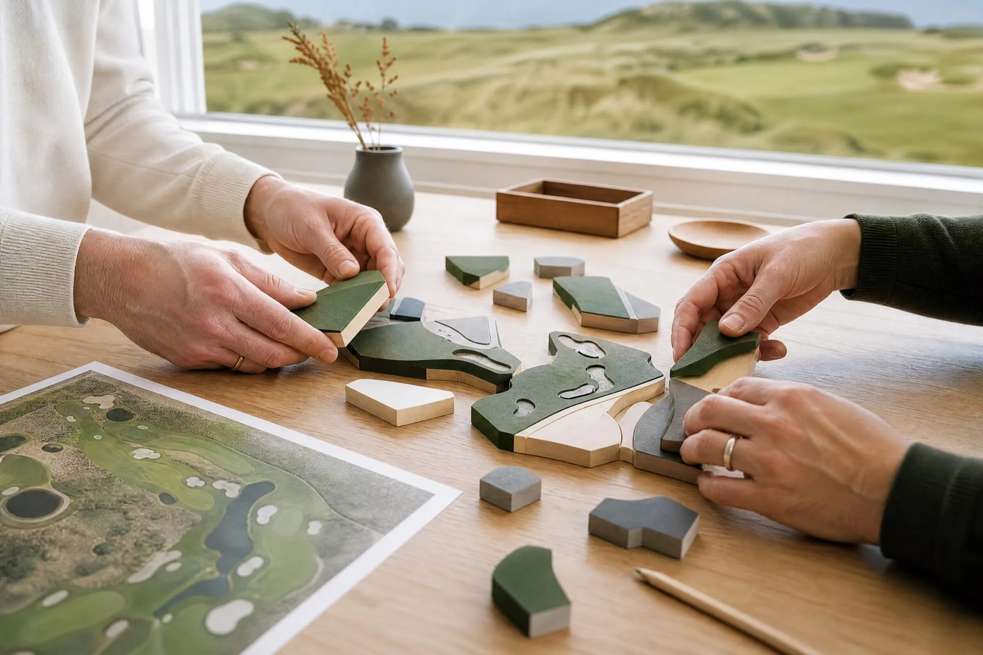
Every app needs the same basic pieces: sign-in, navigation, lists, cards, and a way to talk to servers. The question is whether you rebuild them every time or start from a foundation you have already tested, and spend your effort on what makes the app different. For the St Andrews Links Home of Golf app, we started from shared components. Here is how that worked.
In our view, a brand like St Andrews Links cannot afford an app that feels inconsistent. A component-first approach defines repeatable layouts and behavior up front, so every screen starts from the same parts. Design, engineering, and QA work from shared pieces instead of one-off screens. For how the design side was set up, see how we built the design system.
We reuse two kinds of building blocks:
The system keeps changing. In an internal audit, our iOS team listed components from the St Andrews Links and Foxwoods apps and marked several of them, including a calendar selector and a multi-select control, to move into the shared core. You can read about the Foxwoods side in how we built its digital ecosystem.
A kitchen sink page is one reference that shows every UI building block in one place: text inputs, dropdowns, fonts, and colors. On the Home of Golf app, we styled it to the St Andrews brand at the start of the project. That did two things. Each element was defined once and reused throughout the app, and there was one place to go if the branding ever needed to change.
Brand updates happen. A few months into the project, St Andrews Links updated its digital brand, and the app needed new colors, fonts, and element styles. Because they were defined in shared components, we changed them in one place and the update carried through the app. In our account of the project, that kept a brand change from turning into a screen-by-screen rebuild. More of our finished work is in our work.
Not in our experience. Shared components govern structure and behavior. Brand expression still comes from colors, type, content, and product decisions. The time saved on common pieces can go to what is specific to the product, such as the digital course guides in the Home of Golf app.
A component system pays off most when it keeps improving. Patterns that work on one project become better defaults for the next, adapted to each brand. Our services page explains how we work with hospitality and golf teams.
Planning an app for a heritage brand? Talk to us.
A reusable set of UI and functional building blocks that a team configures for each product. It keeps behavior and quality consistent while letting each brand customize how the app looks.
A single reference that shows every UI building block, such as inputs, dropdowns, fonts, and colors, in one place. Styling it to the client's brand at the start means each element is defined once and reused everywhere.
Not in our experience. Reuse covers structure and behavior. Brand expression still comes from colors, type, content, and product decisions.
It limits one-off work and makes late changes, such as a brand update, easier to absorb because styles are defined in one place. It does not replace testing on real devices.

A shared component system lets your team build faster and respond to brand changes without screen-by-screen rebuilds.