TRANSLATING BRAND INTO PRODUCT: BUILDING A DESIGN SYSTEM FOR THE NEW "HOME OF GOLF" APP
Designing a mobile app for St Andrews Links golfers to enhance their experience.

St Andrews Links, Europe’s largest public golf complex and the world-renowned Home of Golf, partnered with Shockoe to launch a new app. The goal? Deliver an exceptional digital experience for golfers while maintaining the heritage and renown of the 600-year-old St Andrews legacy.
While applying brand guidelines to physical media is common, bringing that essence into a digital product introduces new challenges, particularly around color, hierarchy, information architecture, accessibility, and user interaction. This article walks through how we approached defining a complete user-centered design system for St Andrews Links new app, while keeping the brand’s unique personality intact.
WHERE BRANDING MEETS FUNCTIONALITY
As the St Andrews Links brand was still evolving, our UI design team worked closely with the client and their brand agency to interpret the new look and feel for digital use. Unlike static print or signage, digital interfaces require careful attention to:
- Color contrast and accessibility
- Interactive states
- Hierarchy and depth
- Consistency across screen types and devices
To address this, we started with a color analysis of the brand’s palette, which included unique families: with Sandstone, Evening Sky, Gorse, Brick, Sea, and Land. Each of these colors brought emotional and cultural weight, but we needed to tune their saturation levels and usage patterns for optimal digital performance.
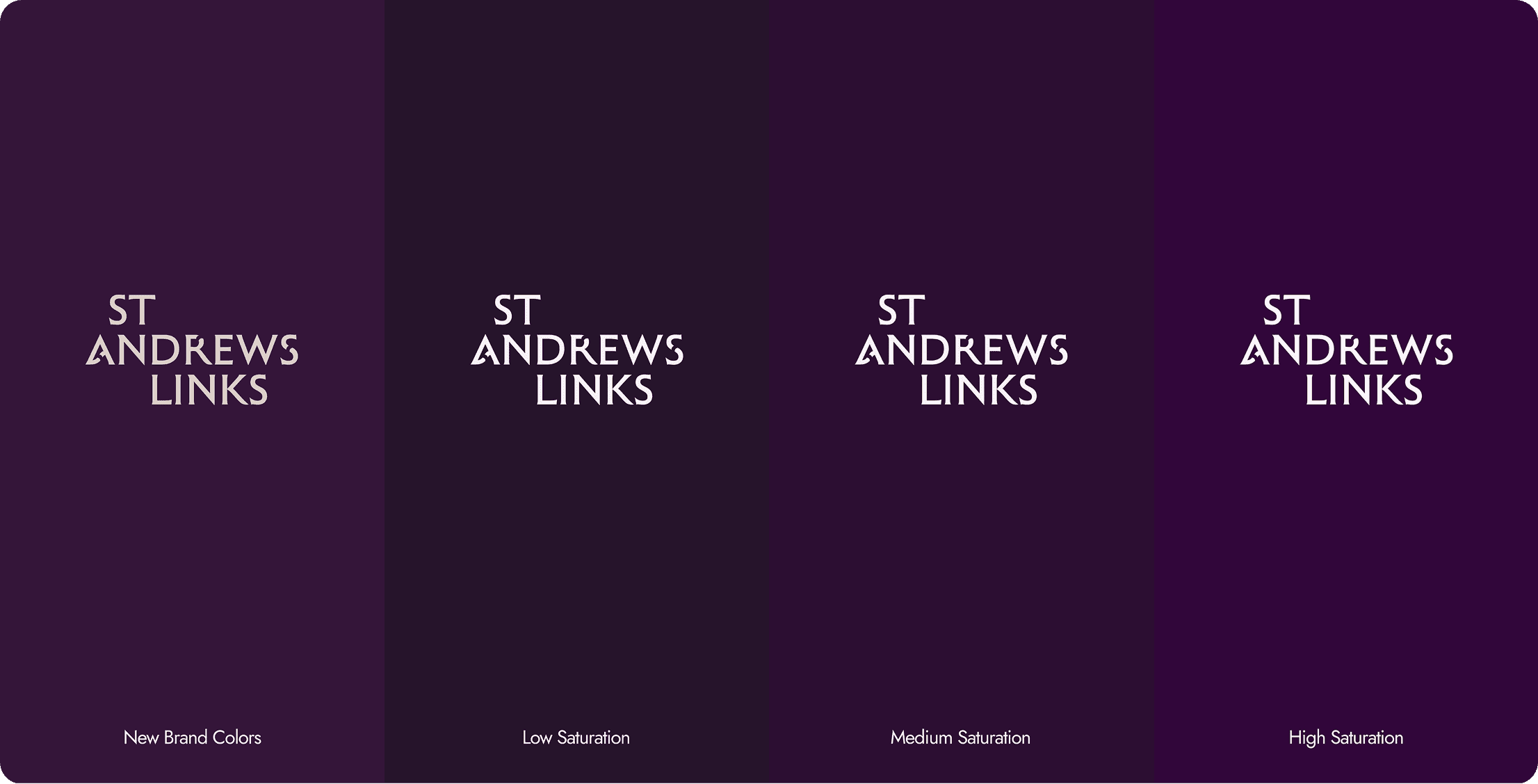
BUILDING A DIGITAL-READY COLOR SYSTEM
Working from the brand’s guidelines, we assessed each color family examining how they could work across UI components, backgrounds, typography, and interactive elements.
- Sandstone became our neutral base, used for backgrounds and navigation components, replacing traditional gray scales.
- Evening Sky was chosen for headers and key highlights, providing contrast and visual structure, almost mimicking the real-world sky above the course.
- By adjusting dark, medium, and light variations of each tone, depth and hierarchy were established throughout the interface.
For supporting colors like Gorse, Brick, Sea, and Land, we defined use cases tied to functionality such as alerts, highlights, and special features giving designers more flexibility while preserving consistency.

FROM COLOR THEORY TO REAL UI: BUILDING THE VISUAL DNA OF THE HOME OF GOLF APP
Creating a design system that feels uniquely St Andrews Links while functioning seamlessly in a digital environment required more than just applying a logo and brand palette. We needed to translate color theory and brand essence into a living, breathing user interface that looks just as beautiful on a phone as gorse does on a golf course.
Inspired by the Atomic Design methodology, we treated the foundational elements, colors and typography, as the atoms of the design system. These are the visual DNA of the brand: subtle yet essential, invisible to some, but crucial to everything that follows.
- Brand Colors were fine-tuned into usable digital values with defined roles primary, secondary, and accents.
- Neutral Tones became the base for backgrounds and surfaces, replacing traditional grays with brand-authentic hues.
- Semantic Colors (for success, warning, and info) ensured we could communicate meaning clearly, without breaking consistency.
This base layer established a cohesive and scalable color system, setting the stage for every interface element to follow.

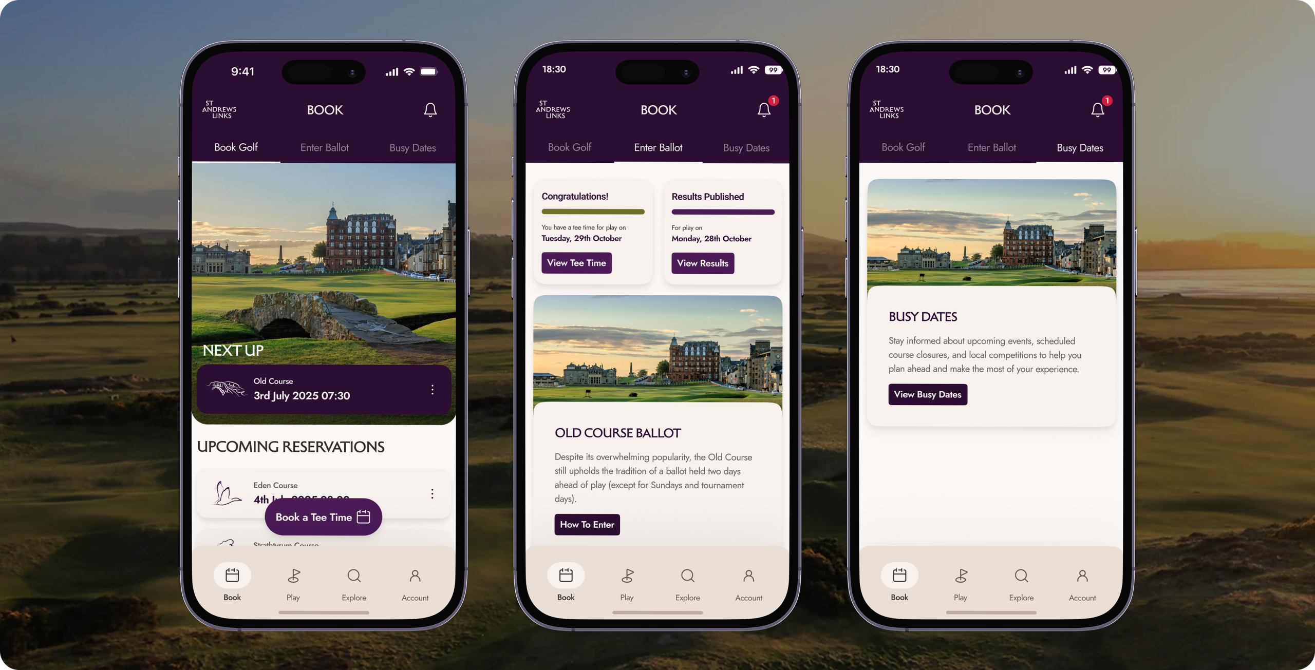
MOLECULES: BUILDING WITH CONSISTENCY
From there, we moved up a level designing molecules: the interactive building blocks of the app. Think buttons, text fields, toggles, and navigation bars. These components were designed with strict consistency in:
- Shape
- Spacing
- Color roles
- Typography
This wasn’t just about looking good. Consistency helps users learn patterns intuitively so interactions feel natural, even effortless.
Whether you’re booking a tee time or exploring the different courses, the interface behaves predictably and reliably.
A FOUNDATION FOR THE FUTURE
This visual system didn’t just make the app beautiful, it made it scalable. By designing with atomic logic, we created a modular, reusable structure that:
- Scales easily with new features
- Supports future accessibility updates
- Keeps the brand intact across all user journeys
Conclusion
Designing the Home of Golf app was about more than just applying colors, it was about transforming a historic brand into a digital product that flexes to users’ needs. By balancing creativity with strategic UI thinking, we transformed a timeless golf legacy into a modern, intuitive product one that honors the past while helping users stay focused on what really matters: experiencing the Links.
This transformation was only possible through a close, hand-in-hand collaboration with St Andrews Links. Their team provided the business logic, insights, and vision that guided every decision. It was a great example of what happens when brand, design, and strategy come together.

Unlock your AI ADVANTAGE
Our AI Success Roadmap includes our 4 Success Pillars, with custom next steps for continuing your AI journey.
